Design for desktop, tablet and mobile
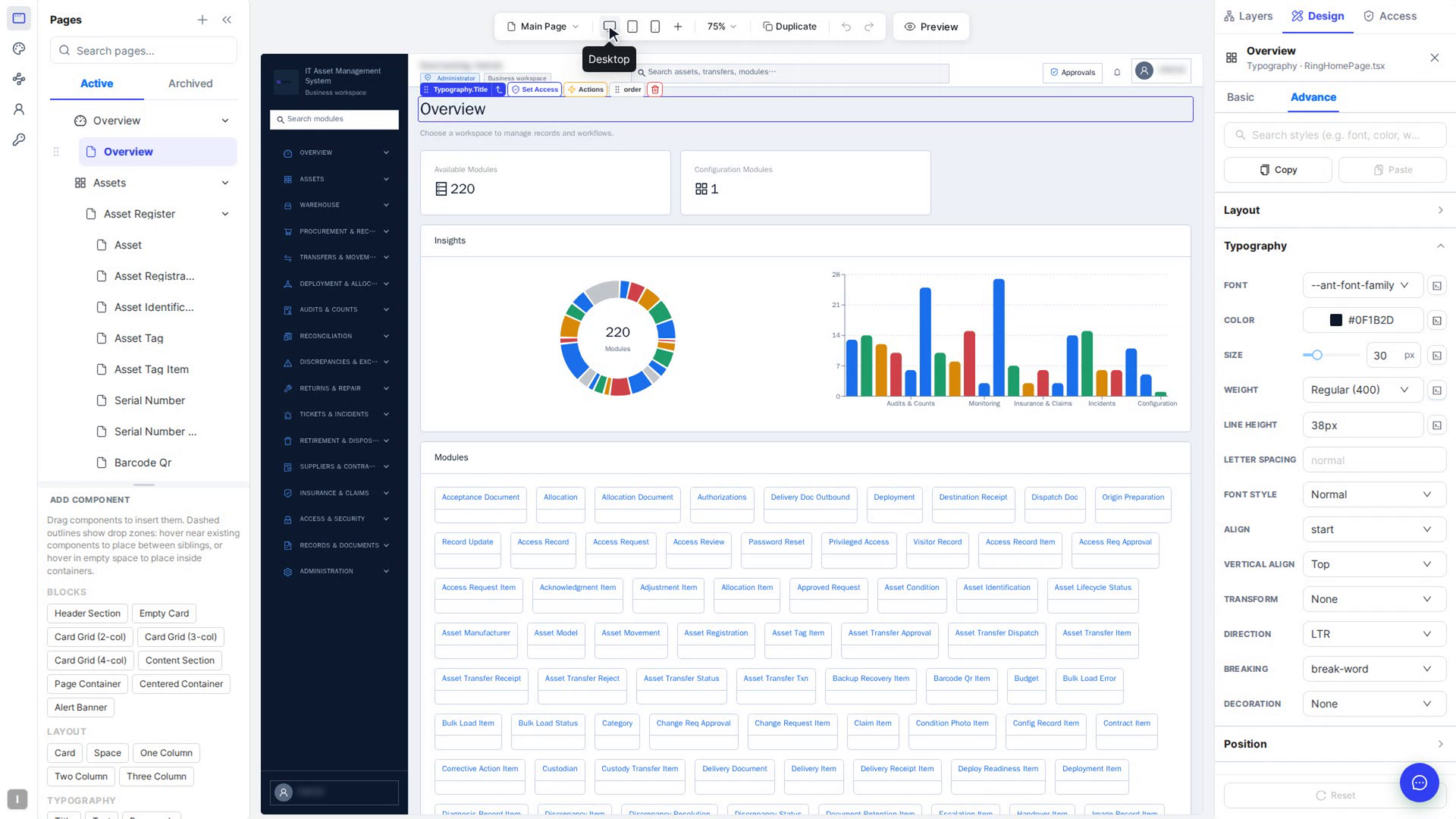
Give an element different settings and styles on different screen sizes, for example a smaller heading on tablets or more space around a card on phones. The screen size you pick above the canvas decides where your changes go.
Before you start
- You need access to your app's Customize tab (usually a team admin).
- Open the page you want to work on (see Open the editor and find your way around).
How screen sizes work
- Desktop is the base. What you set on Desktop applies to every screen size, unless a smaller screen has its own value.
- Tablet (≤991px) changes apply at that width and narrower, and override Desktop.
- Mobile (≤575px) changes apply only at phone widths.
- More breakpoints (the +) adds three more sizes in between: Extra large (≤1599px), Large (≤1199px) and Small (≤767px). They work the same way.
Steps
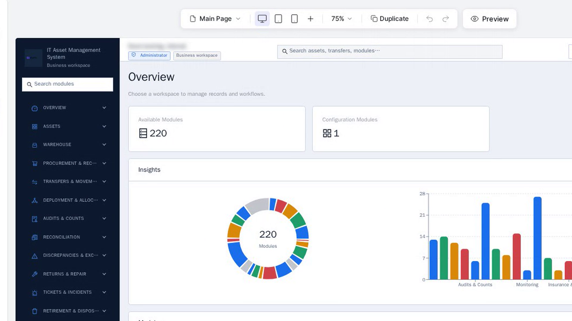
Choose a screen size
In the bar above the canvas, select Tablet (or Mobile). The canvas narrows to that width. For the other sizes, select More breakpoints (the +) and choose Extra large, Large or Small.
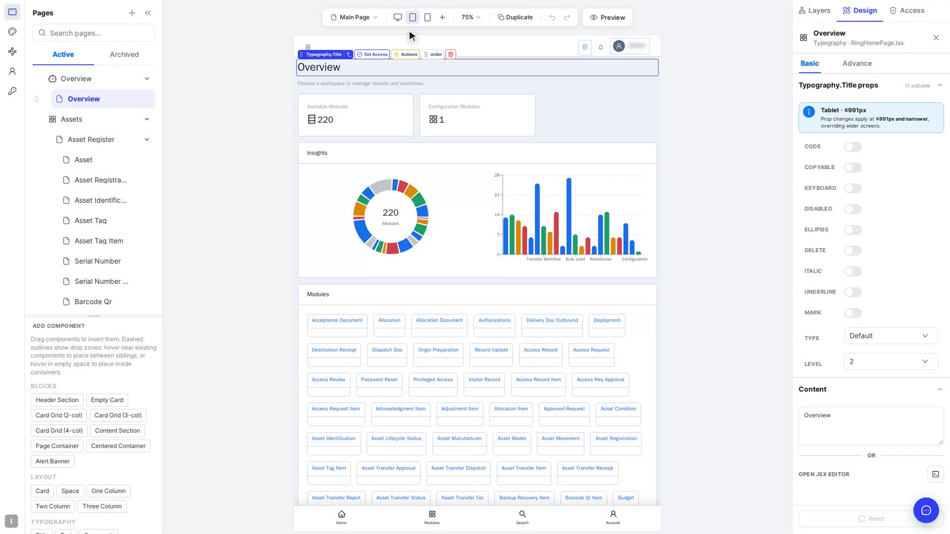
Select the element you want to change
Click the element on the canvas. At the top of the Design tab, a blue note shows the size you are editing, for example Tablet · ≤991px:
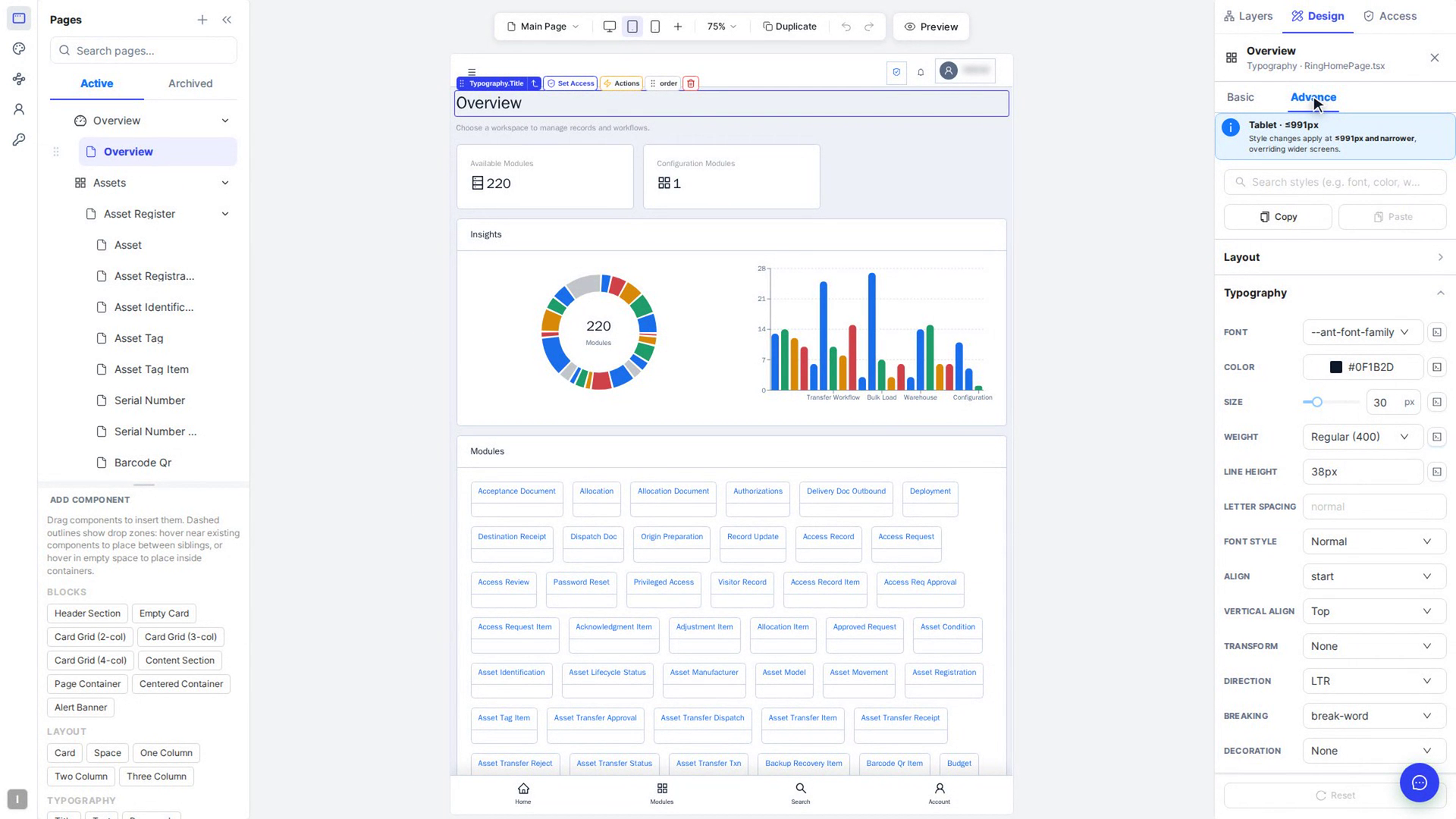
- On the Advance tab it reads Style changes apply at ≤991px and narrower, overriding wider screens.
- On the Basic tab it reads Prop changes apply at ≤991px and narrower, overriding wider screens.
Make your change
Change a setting on Basic or a style on Advance, as you would on Desktop (see Style elements). The change only applies at this width and narrower.
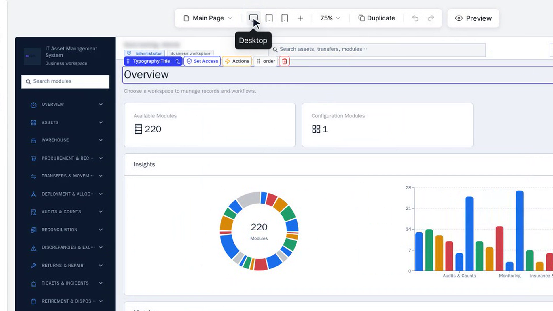
Check the other screen sizes
Select Desktop in the bar above the canvas. The desktop version of the page is unchanged. Switch back to Tablet to see your change again.
Go back to the wider screen's value
On the Basic tab, a setting that has its own value on the current screen shows a circular arrow next to its name (Set for this screen — click to inherit from a wider screen again). Select it to remove the screen-specific value, so the setting follows the wider screen again.
For a style on the Advance tab, select the arrow next to its Modified tag, or select Reset at the bottom of the panel to undo all your style changes to the element.
Screenshots
Step 1: Choose a screen size
Step 2: Select the element you want to change
Step 3: Make your change
Step 4: Check the other screen sizes
Step 5: Go back to the wider screen's value
Watch how
Tip: Make your main design on Desktop first, then adjust only what needs to be different on smaller screens.