Change element properties (Basic tab)
The Basic tab of the Design panel controls what an element is and what it says: its built-in options (properties), its text and its icon. Use it to turn a button red, change a label, or add an icon.
Before you start
- You need to be a team admin who can open your app's Customize tab.
- Your app must have finished building, and the page you want to change must be open in the editor. See Select elements.
Steps
Select the element and open Basic
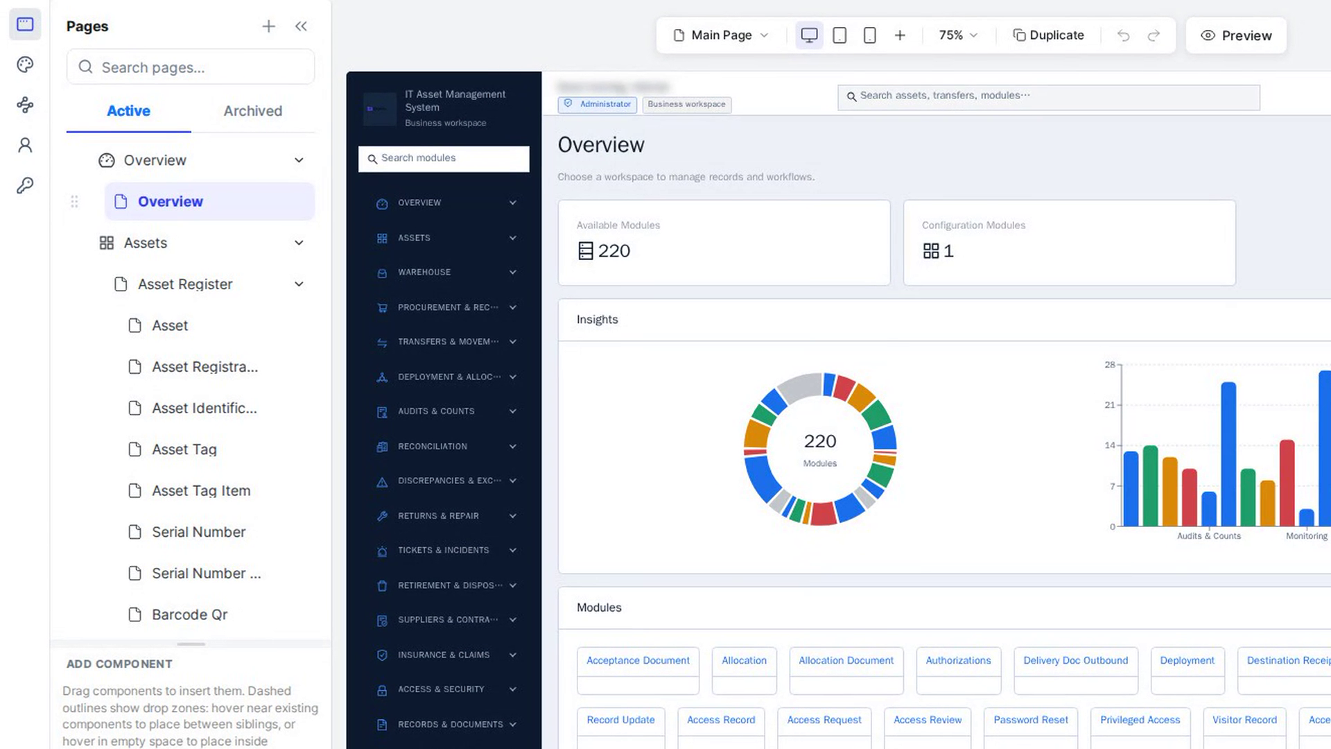
Click the element on the canvas. The Design tab opens on Basic, the first of its two tabs. Advance holds the styles; see Style elements in detail.
Know the controls
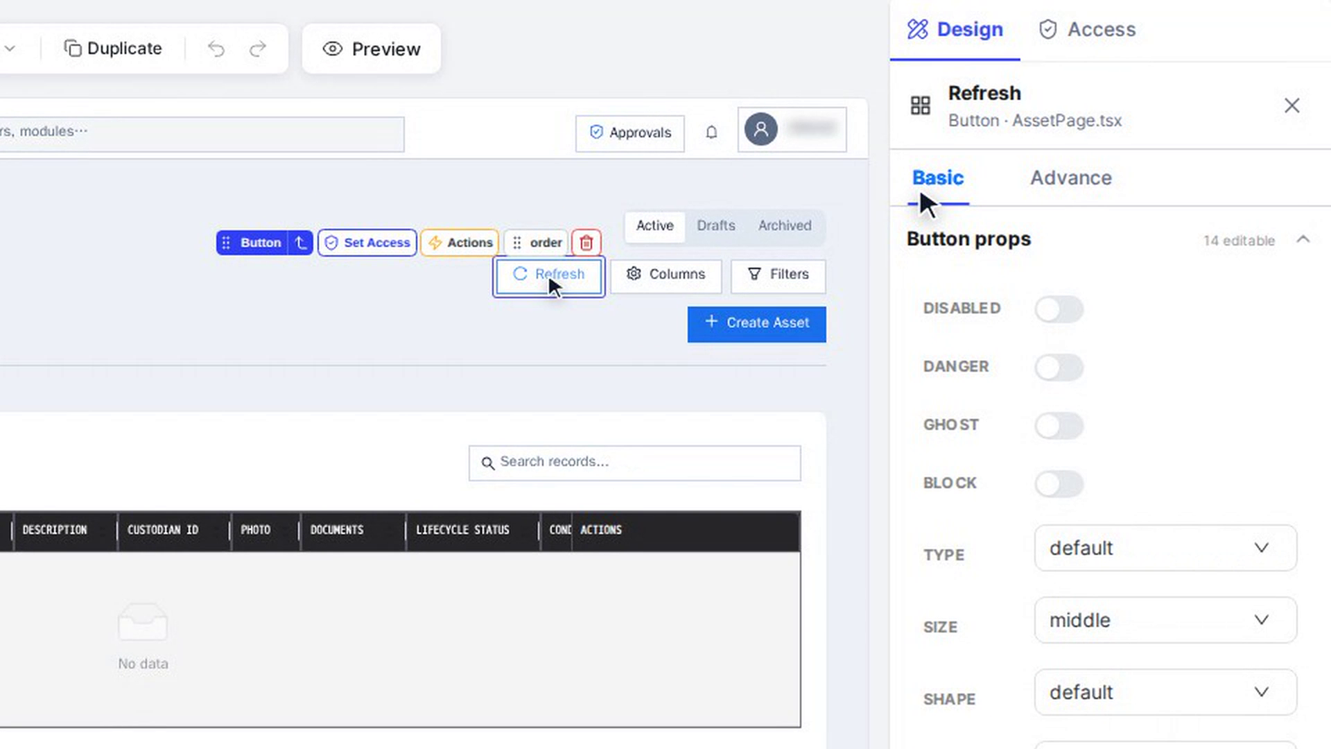
The first section is named after the element, for example Button props or Typography.Title props. On the right of its title you see how many properties you can edit, for example 14 editable. Each row is one property, and the control depends on the kind of value:
| Control | How to use it | Examples |
|---|---|---|
| Switch | Click to turn the option on or off. | Disabled, Danger, Ghost, Block |
| Drop-down | Open it and pick a value. | Type, Size, Shape, Variant |
| Number box | Type a number or use the arrows. | Max length, Page size |
| Text box | Type text. The canvas updates as you type. | Href, Placeholder, Title |
| Colour | Click the swatch to pick a colour, or type a hex value. | Color on a Tag or Badge |
| Tag list | Type a value and press Enter (Add a value…). Click × on a tag to remove it. | Page size options |
| Icon | Pick Icon or Change Icon opens the icon picker. | Icon on a Button |
| Rich content | Add JSX or Edit JSX opens the JSX editor. | Title with an icon, Extra, Footer |
A value in grey is the element's default: nothing has been set for it yet. Only the options that make sense for this element right now are shown.
You may also see these labels:
| Label | What it means |
|---|---|
| computed | The value is worked out while the app runs (This value is built at runtime, so there is nothing static to edit here.). |
| N outcomes | The property has a different value depending on a condition. Each outcome can be edited on its own. |
| Applies to | Shown for elements repeated from a list, such as one card of many. Choose whether you are changing this one or all of them. |
| per item | Each copy has its own value. Use Edit this copy. |
| Edit anyway | A risky property, such as a dialog's footer, is locked. Select Edit anyway to unlock it, or Leave it alone. |
| ↺ next to a property | On Tablet or Mobile: the value is set for this screen size. Click it to follow the wider screen again. |
Change a property
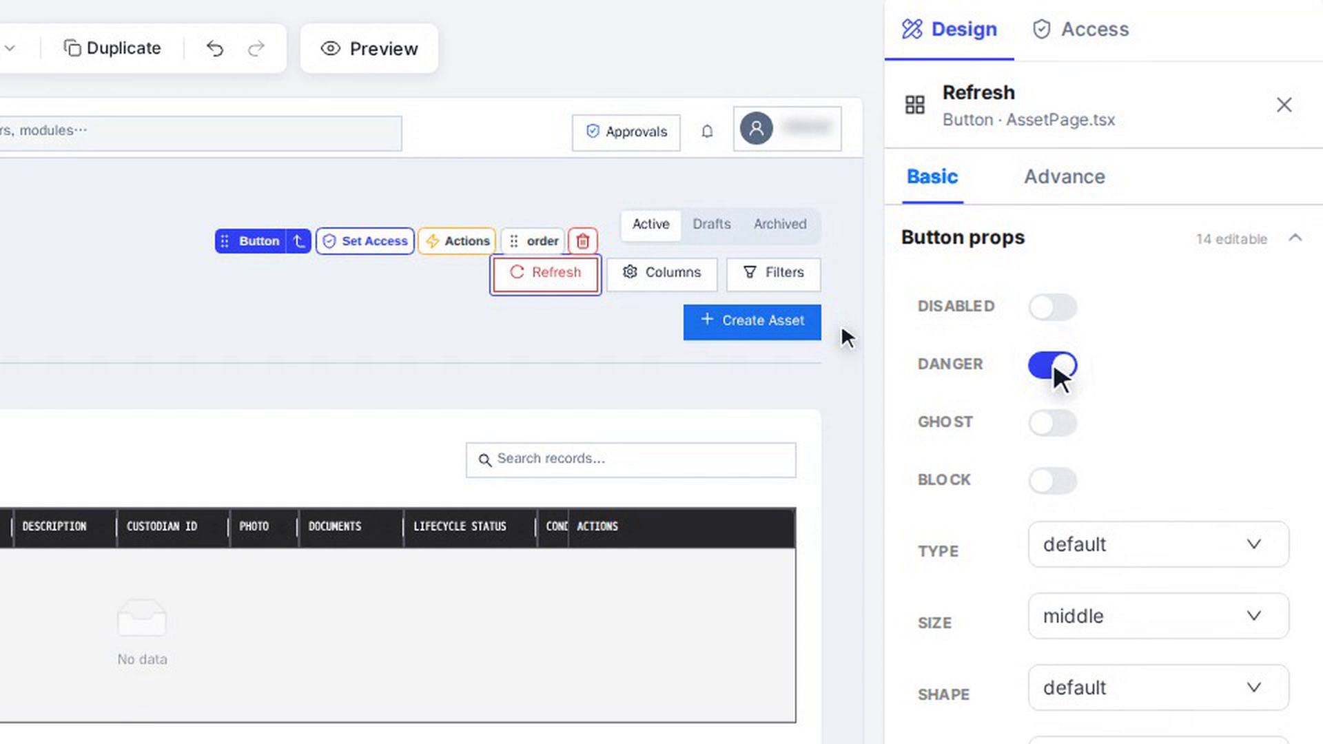
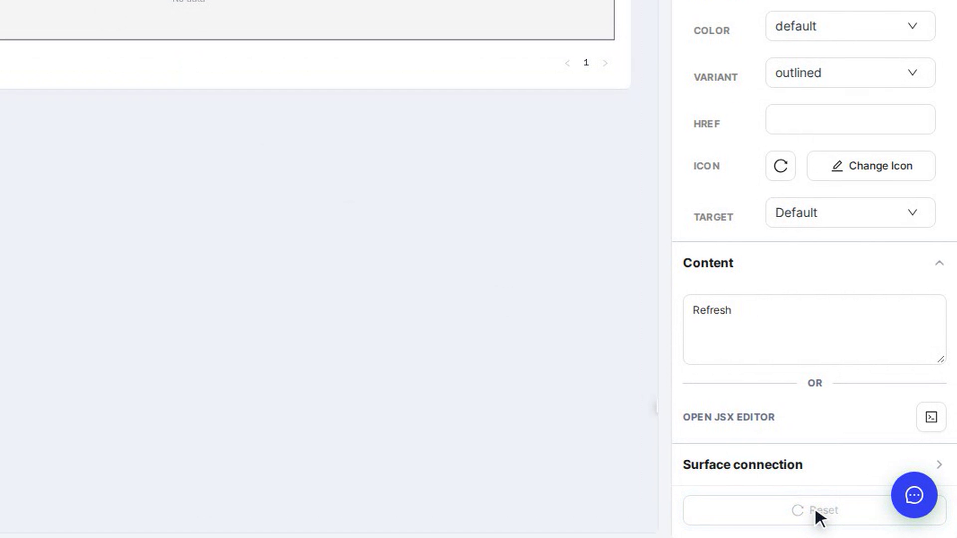
Click a switch or pick a value, for example turn on Danger. The canvas shows the change straight away, and it saves on its own.
Change the text
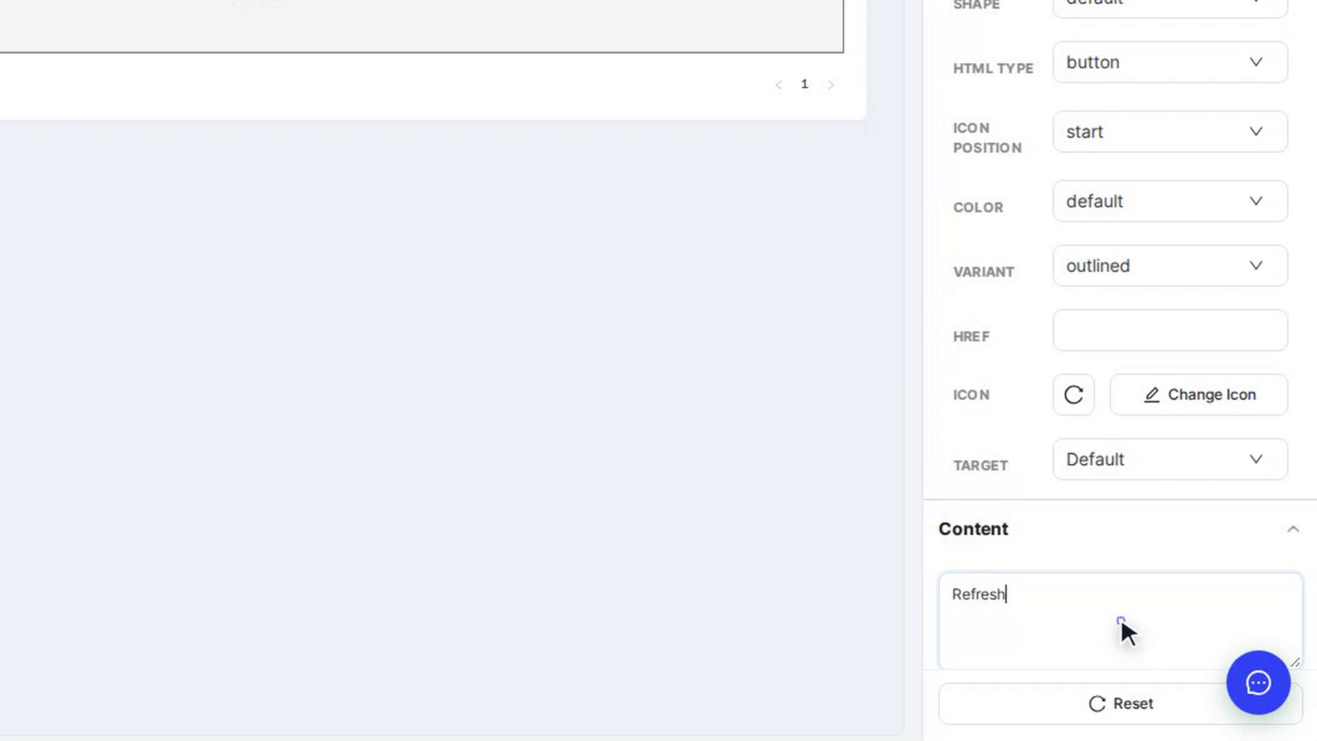
Scroll to Content and type the new text in the text box. The page rebuilds, and after a moment the canvas shows the new text.
Depending on the element, Content can also show a text box per text property (such as a card's title), a small data list you can View or Edit, or list editors for options, menu items or table columns.
Buttons, switches and toggles also have Surface connection: pick a pop-up or panel from the list to open it when the element is clicked.
Add rich content with the JSX editor
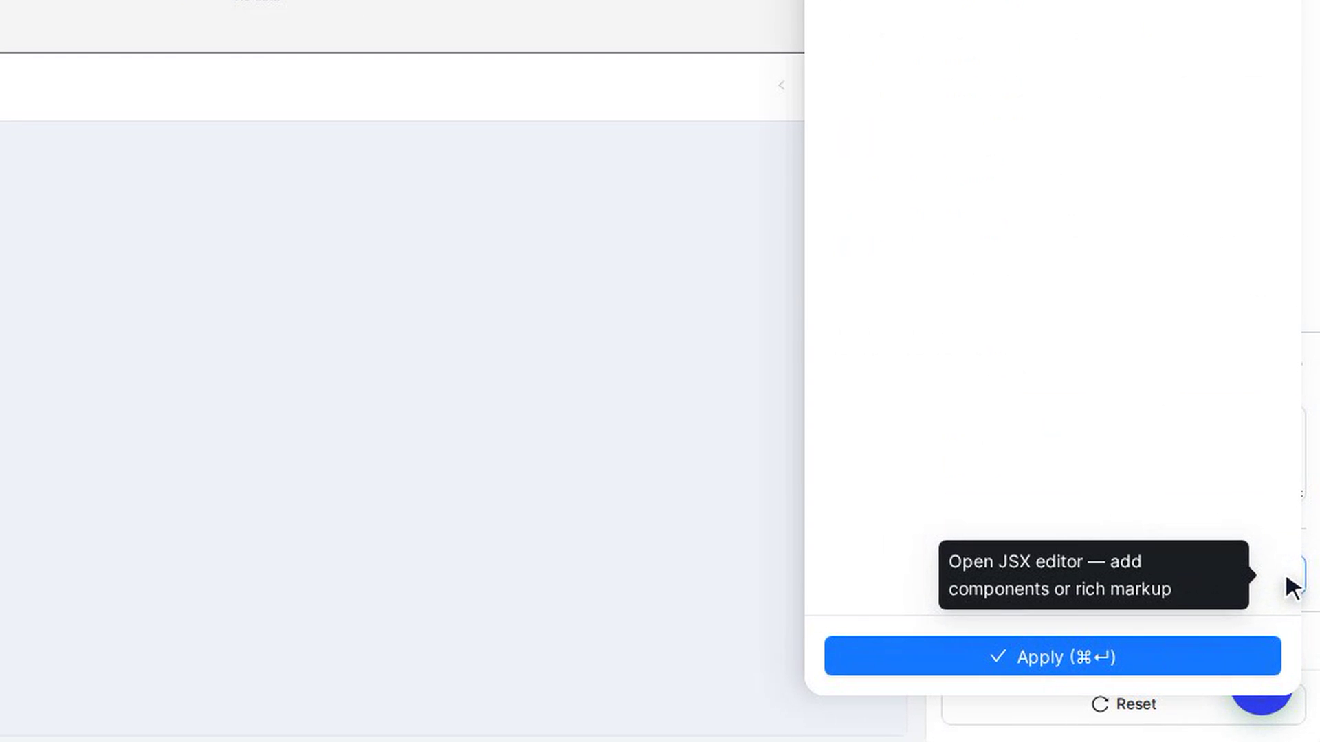
For bold words, a tag, a badge or an icon inside the text, click the button next to Open JSX Editor. The Edit JSX panel opens:
- Edit the content in the Code box. The tag next to the title (for example children) shows which part you are editing.
- Click a snippet (Space, Tag, Badge, Tooltip, Button, strong, em, code, br) to insert it, or Icon to insert an icon at the cursor.
- Check the Preview below the editor.
- Click Apply (⌘↵) to keep your change. Done or ✕ closes the panel without applying it.
The toolbar buttons also show the difference from the original, copy the code, and Reset to original.
Choose an icon
Next to Icon, click Pick Icon (or Change Icon if there is one already). In Choose Icon:
- Choose Antd Icons (the built-in library), Inline SVG (paste your own SVG) or Image URL (link to a picture).
- In Antd Icons, pick Outlined, Filled or Two Tone, and type in Search icons… to filter.
- Click an icon. It is added to the element and the window closes.
To put the original back, click the arrow next to Change Icon (Revert to …).
Undo your changes
Click Reset at the bottom of the panel. On the Basic tab it puts back the element's original properties, text and icon; styles on Advance are not touched. Reset is greyed out when there is nothing to undo.
Screenshots
Step 1: Select the element and open Basic
Step 2: Know the controls
Step 3: Change a property
Step 4: Change the text
Step 5: Add rich content with the JSX editor
Step 6: Choose an icon

Step 7: Undo your changes
Watch how
Every change saves on its own a moment after you make it, even while you are only trying things out. If you change something by mistake, click Reset or press ⌘/Ctrl + Z straight away.
Tip: Undo with the keyboard doesn't work while your cursor is in a text box. Click the canvas first.