Customize
The Customize editor lets you change your generated app yourself, without writing code: its pages, components, styles, theme, data forms, users and who can see what. This page covers everything the editor does, in the order you'll usually need it.
Before you start
- You need to be able to open your app's Customize tab (usually a team admin).
- Your app must have finished building. While it's still building, the Customize tab shows a loading screen.
- Most changes save as you make them. There's no separate Save button, except for form fields and flows (see below).
The editor at a glance
Open your app from your Dalfin home, then select Customize in the bar at the top, next to Interface and Code. The editor shows your app in the middle, with panels around it.
| Part of the screen | What it's for |
|---|---|
| Left icon bar | Switches between Application (pages and components), Theme, ER Diagram, User Management and Roles and Permissions. Hover over an icon to see its name. |
| Pages panel | Lists your app's pages. Type in Search pages… and select a page to open it. |
| Add Component | Below the page list: the components you can drag onto a page. |
| Canvas | The open page as your users see it. The bar above it has the page menu (Main Page), Desktop / Tablet / Mobile, the zoom level, Duplicate, Undo / Redo and Preview. |
| Right panel | Design (the selected element's content and look), Access (who can see it) and Layers (where it sits in the page). |
At the top of the screen, Reload canvas (the circular arrow) refreshes the canvas, and Open in another tab opens your app in a new browser tab.
Select elements
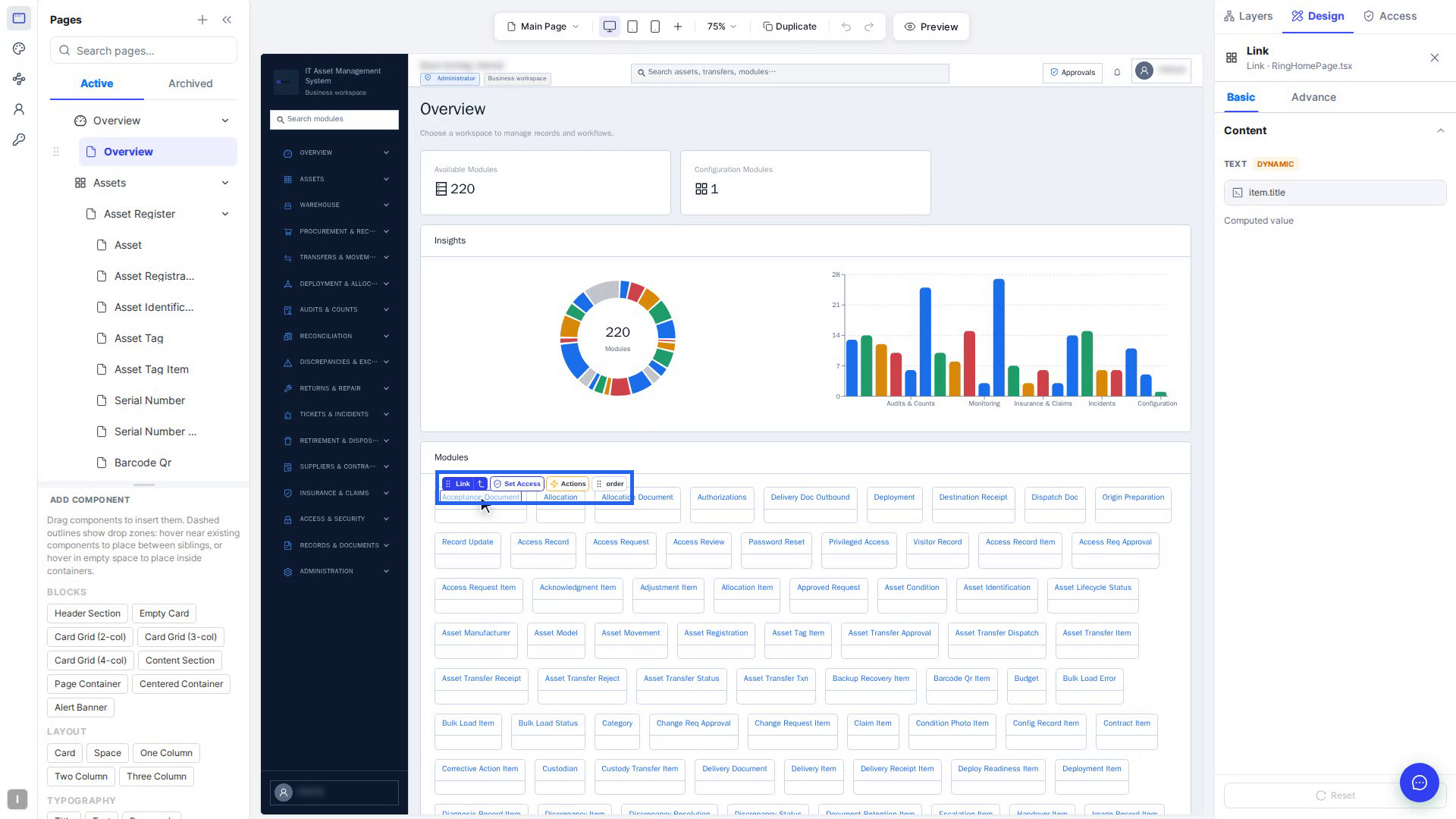
Click anything on the canvas: a heading, a button, a card or a field. It gets a blue outline, a selection chip appears above it, and the Design tab shows its settings. Select ✕ next to its name to deselect it.
| Chip item | What it does |
|---|---|
| Grip and element type | Drag it (Drag to move) to move the element. |
| Arrow (Select parent container) | Selects the element around this one. |
| Set Access | Opens the Access tab for this element. |
| Actions | Makes the element start a flow (see Make elements do things). |
| order / list | Opens Reorder items to change its place among its neighbours. |
| Red bin | Deletes the element. |
- Alt-click (Option on a Mac) selects the element behind the one on top.
- Shift, ⌘ or Ctrl-click selects several elements. The bar at the bottom lets you Group them into a Div, Flex row, Space, Row / Col or Card.
- The Layers tab shows the whole page as a tree. Click a row to select that element.
Change what an element is and says (Basic tab)
The Basic tab of Design holds the element's built-in options, its text and its icon.
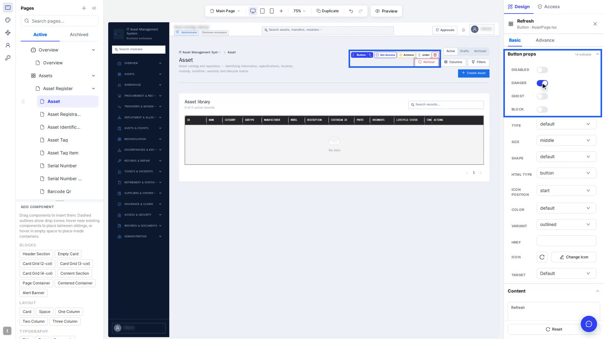
- The first section is named after the element, for example Button props, with a count such as 14 editable. Use switches (Disabled, Danger, Ghost), drop-downs (Type, Size, Shape), number and text boxes, colour swatches and tag lists. Grey values are defaults.
- Content holds the text, label, placeholder or title. Type the new text and the canvas updates after a moment.
- Surface connection (buttons, switches, toggles) picks a pop-up or panel to open on click.
- Open JSX Editor adds rich content, such as bold words, a tag, a badge or an icon inside the text. Select Apply (⌘↵) to keep it.
- Pick Icon / Change Icon opens Choose Icon: Antd Icons, Inline SVG or Image URL.
For example, rich content in the JSX editor looks like this:
<Space>
  <Badge status="success" />
  <strong>Active assets</strong>
</Space>
Change how an element looks (Advance tab)
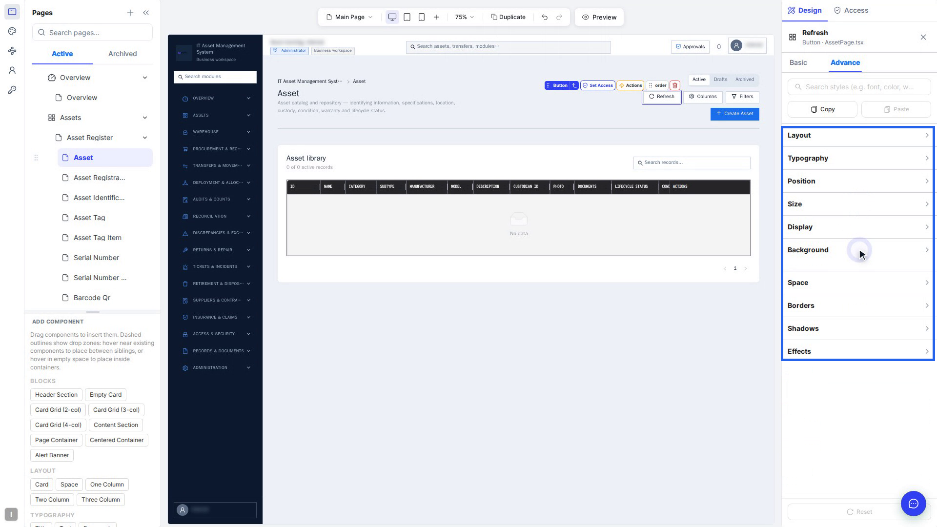
The Advance tab holds the styles, applied on top of your app's theme. Type in Search styles (e.g. font, color, weight)… to jump to a setting. A changed field is marked Modified, and the arrow next to it reverts just that field.
| Section | What you set there |
|---|---|
| Layout | Display (Block, Flex, Grid…), direction, alignment, wrapping and gaps |
| Typography | Font, colour, size, weight, line height, letter spacing, alignment, decoration |
| Position | Static, Relative, Absolute, Fixed or Sticky, offsets and Z-index |
| Size | Width, height, minimums and maximums, aspect ratio, overflow |
| Display | Visibility, cursor, pointer events, flex options |
| Background | A colour, a gradient or an image |
| Space | Padding (inside) and Margin (outside) |
| Borders | Width, style, colour and Border radius (rounded corners) |
| Shadows | Box Shadow and Text Shadow |
| Effects | Opacity, filters, backdrop blur and transforms |
-
Use a CSS variable (the small square next to most fields) links the field to a shared design value. Change the variable once and every element using it follows. A variable name starts with
--, for example:--radius-card: 12px; --color-brand: #1f6feb; -
Copy and Paste give another element the same look.
-
Reset at the bottom undoes all your changes on the open tab. Reset on Basic doesn't touch styles, and Reset on Advance doesn't touch properties.
Design for desktop, tablet and mobile
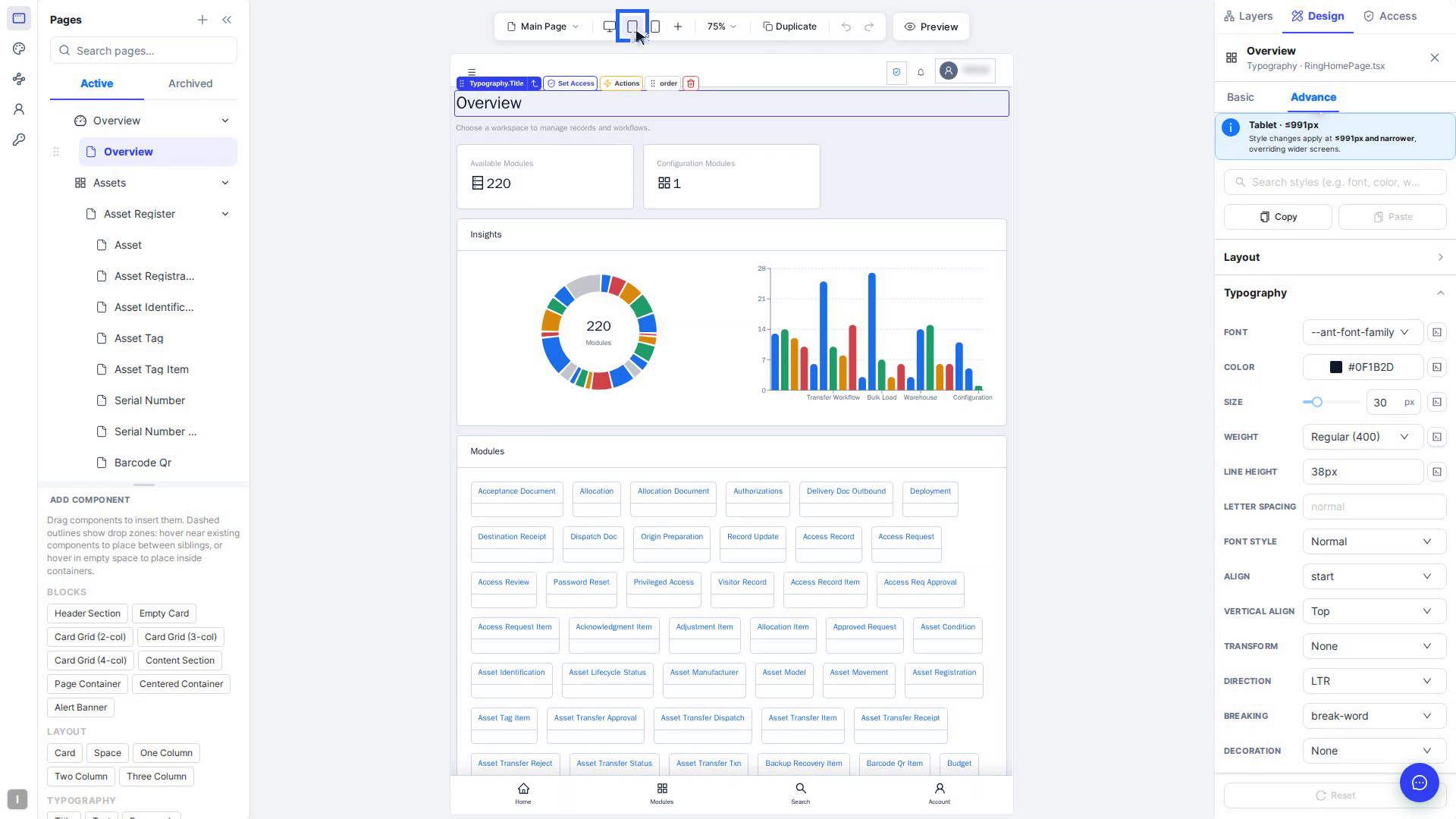
Pick a screen size in the bar above the canvas. What you change then applies at that width and narrower.
| Size | Applies at |
|---|---|
| Desktop | Every screen, unless a smaller one has its own value |
| Extra large | ≤1599px |
| Large | ≤1199px |
| Tablet | ≤991px |
| Small | ≤767px |
| Mobile | ≤575px |
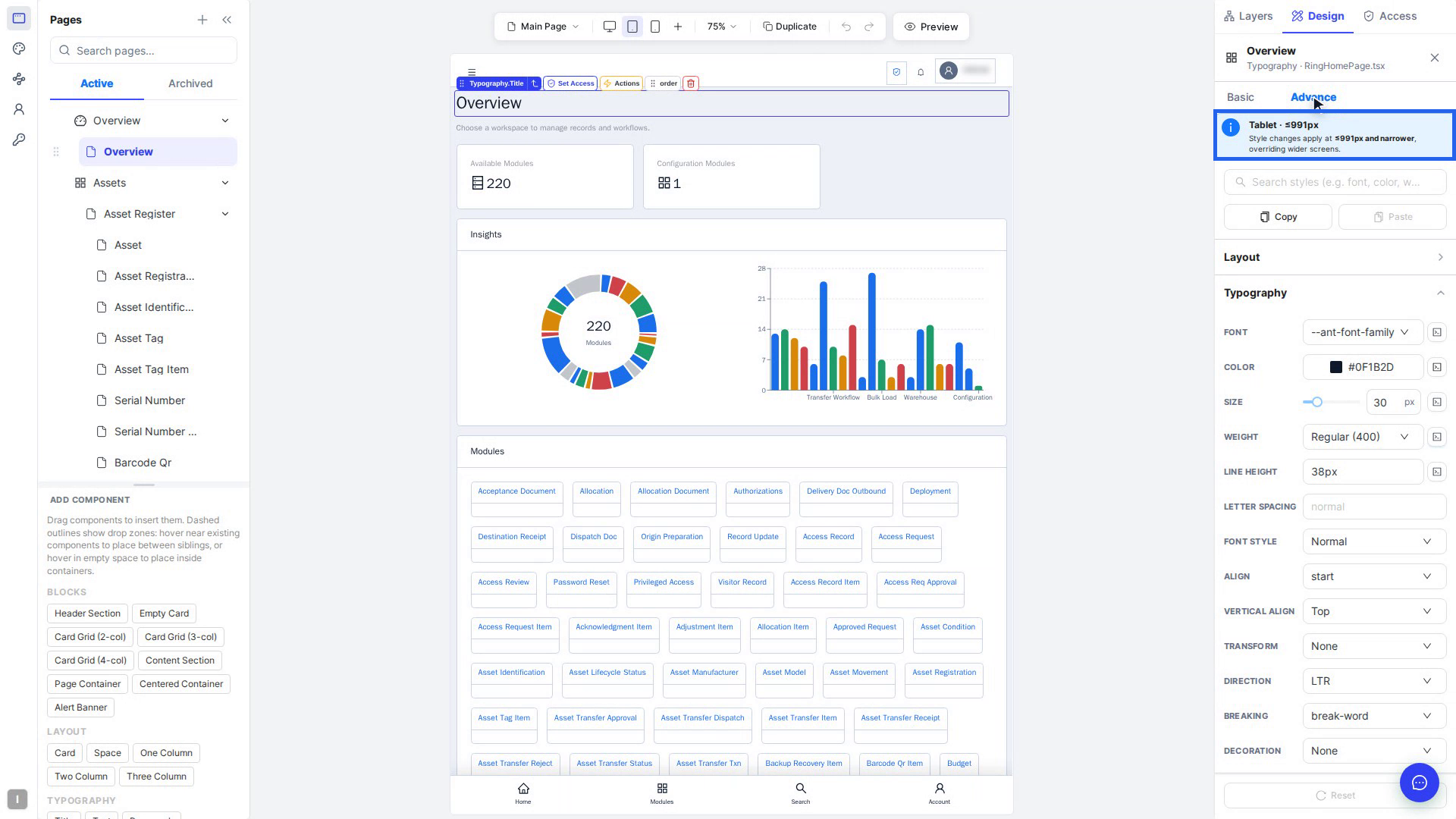
Extra large, Large and Small are under More breakpoints (the +). A blue note at the top of the panel, such as Tablet · ≤991px, shows which size you're editing. To go back to the wider screen's value, select the circular arrow next to a setting on Basic, or the arrow next to Modified on Advance.
Add and move components
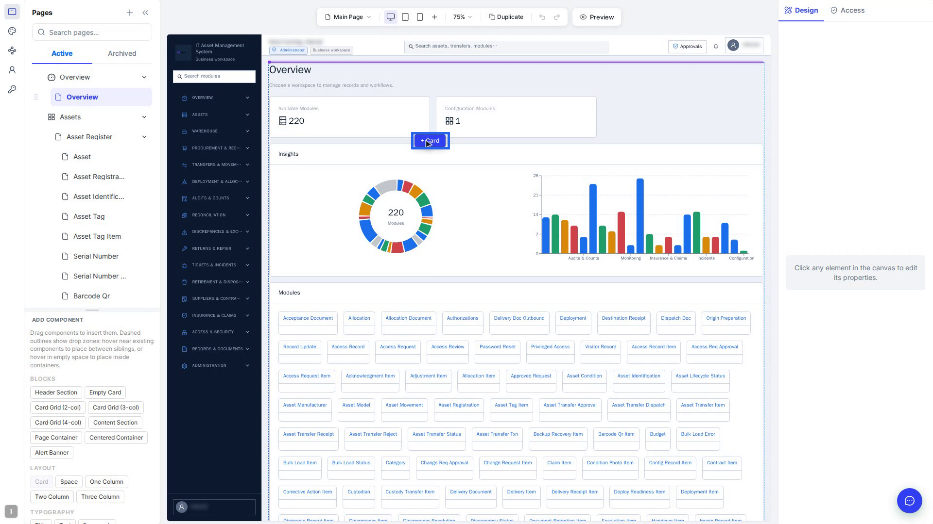
- Add a component: drag a tile from Add Component onto the canvas. Groups are Blocks (ready-made sections such as Header Section or Card Grid (3-col)), Layout, Typography, Display, Navigation, Feedback, Overlay, Input and Form. Switch the right panel to Design first. You can't add components while Access is open.
- Check where it lands: a green dashed outline means inside that container, and a blue gap with ↕ Insert here, ↓ Into or After means between elements. ↻ Adds to all means it goes into every repeated copy. A red label means you can't drop it there.
- Let go: you see … inserted — rebuilding MFE…, then the new element appears selected. Press Esc while dragging to cancel.
- Move an element: select it and drag the grip in its chip.
- Exact order: select order in the chip to open Reorder items, use the arrows or drag rows, then select Apply.
Make elements do things with Actions
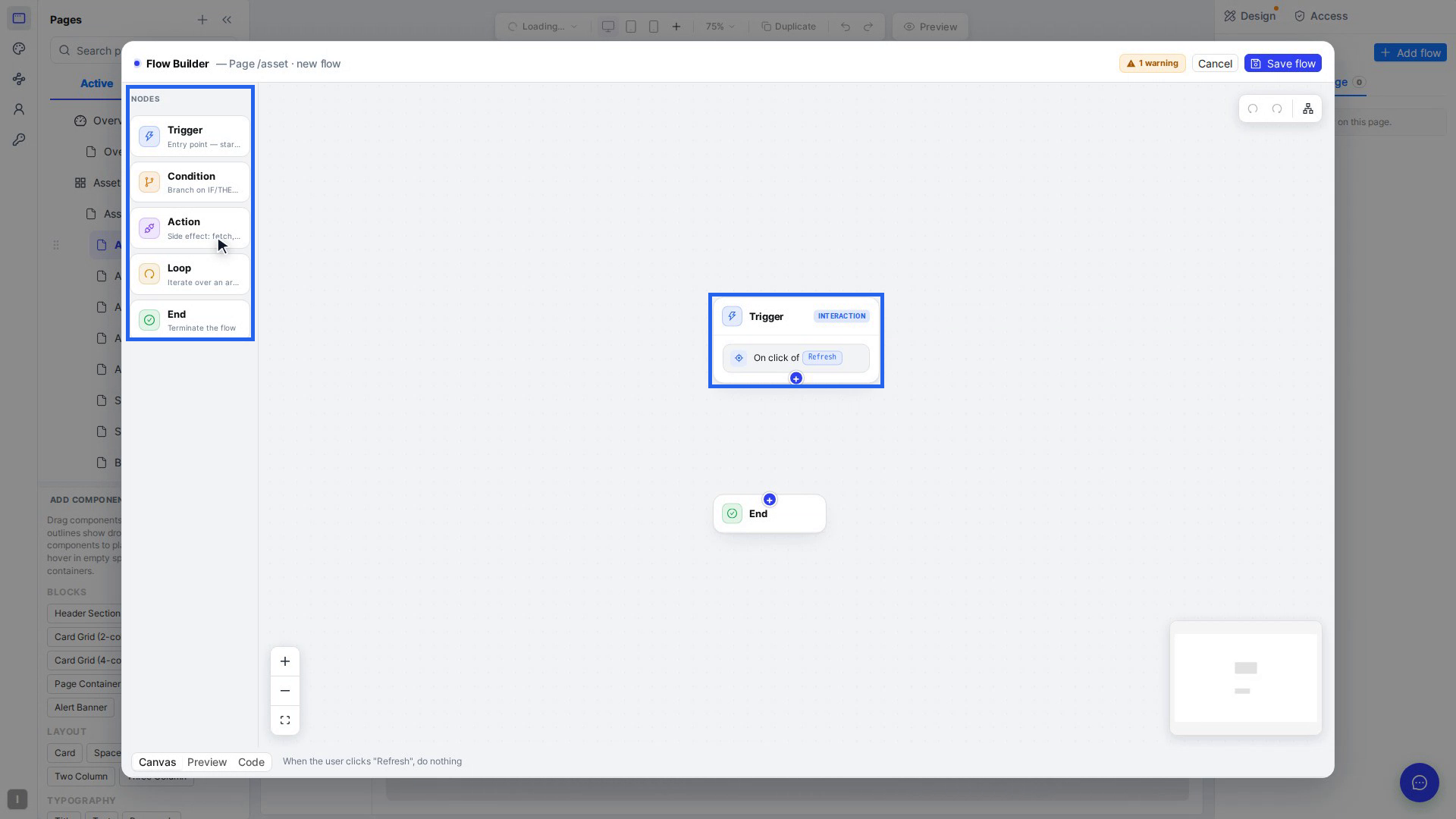
Select an element, then Actions (the lightning icon) in its chip. The Flow Builder opens on a new flow, for example When "Refresh" clicked.
- Trigger: what starts the flow, such as Click, Hover, Change, Page load, Interval or State change.
- Action: select + under the trigger and choose Action. Then pick what happens: Show / Hide / Enable / Disable an element, Set style, Navigate, Toast / notify, Fetch (HTTP request), Execute workflow or Log.
- Condition and Loop branch into TRUE / FALSE paths or repeat steps for each item in a list.
- Select Save node for each step, then Save flow to turn the flow on.
The bottom bar sums the flow up in plain words and switches between Canvas, Preview and Code. Your flows are listed in the Flows panel under Global (every page) or This page. Copy as JSON and Import JSON move a flow between pages.
Theme your app
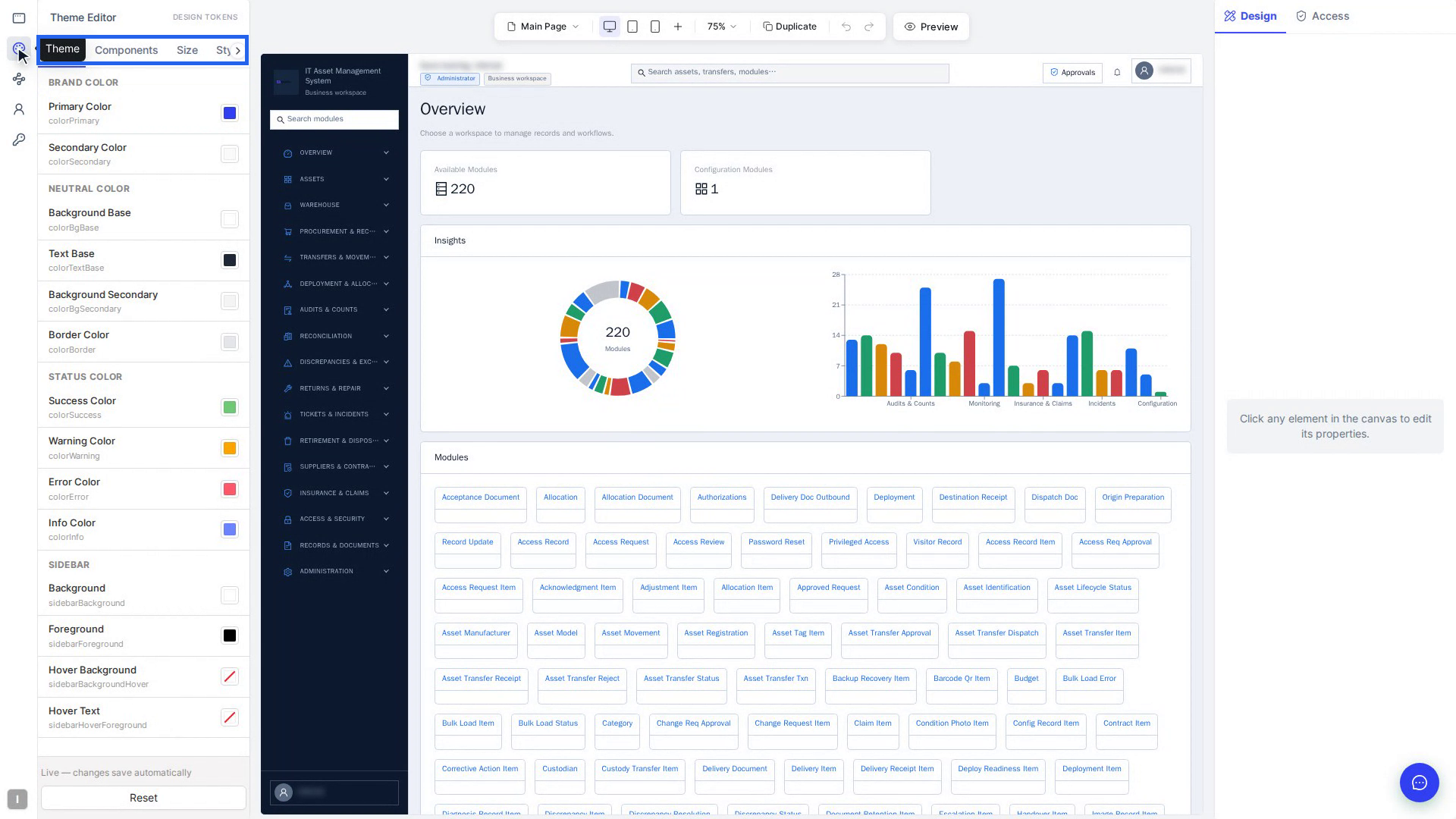
Select Theme (the palette icon) on the left bar. The Theme Editor has six tabs:
| Tab | What you set there |
|---|---|
| Color | Brand, Neutral, Status and Sidebar colours |
| Components | The look of one component type, with a live preview |
| Size | A Font Size preset, or Body, Label, Heading and Display sizes one by one |
| Style | Spacing, Border Radius, App Radius Scale and per-component radius |
| Variables | The style variables in your app's code. Search, edit or add a New variable |
| Font | Use a font for the whole app, or only for the selected element |
Theme changes save by themselves. The bottom of the panel shows Auto-saving to code…, then Saved to code.
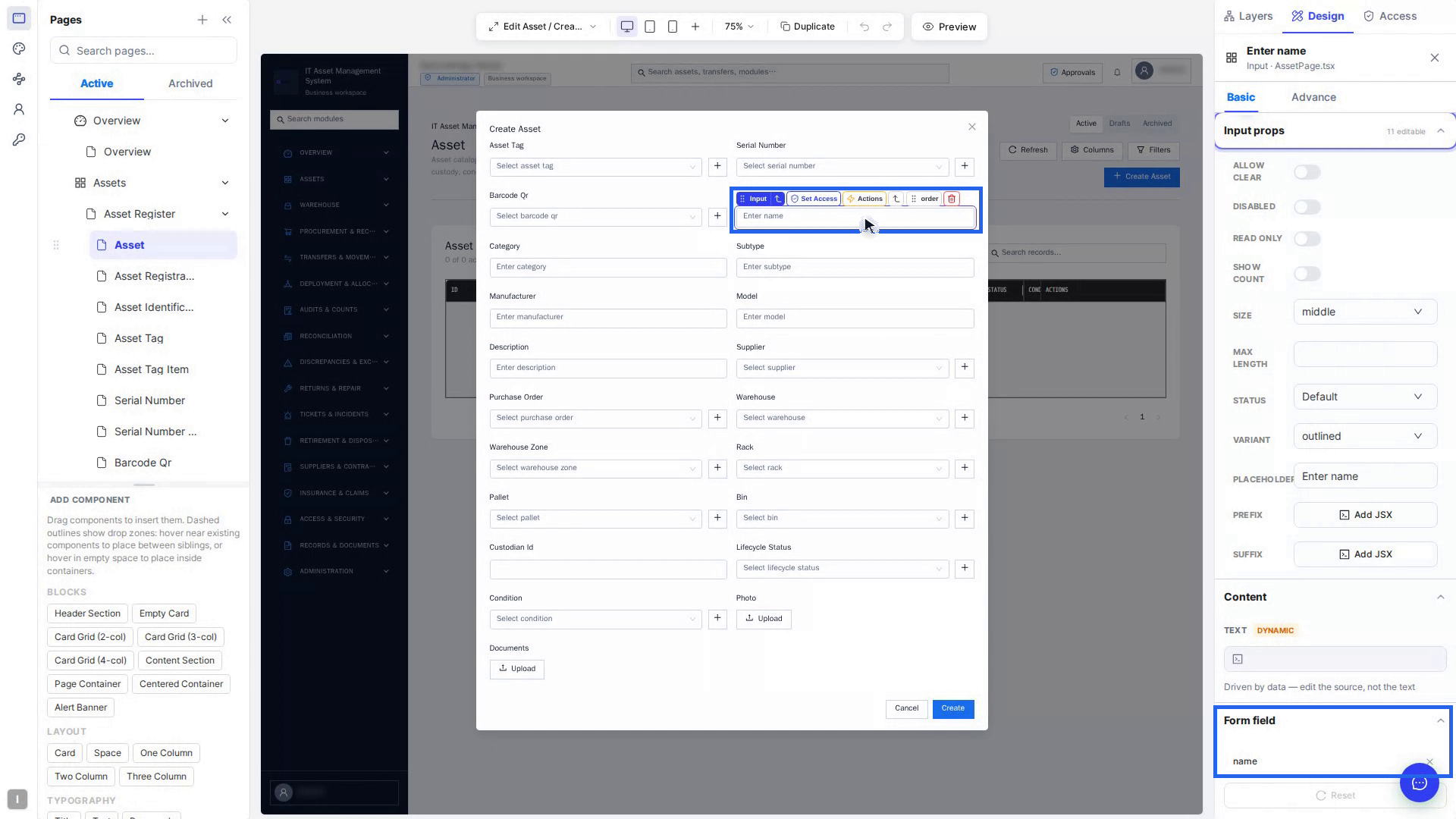
Set up form fields
Select a form field, then expand FIELD PROPS: Field Name (the key it's saved under), Label, Type (Text, Email, Password, Number, URL, Tel), Placeholder, Mode for selects, Picker and Format for dates, Help Text and Disabled. Under VALIDATION, turn on Required and set Min Length / Max Length or Min / Max.
Form field changes wait to be saved. If you leave the page first, the Unsaved changes window offers Save & Proceed or Discard changes.
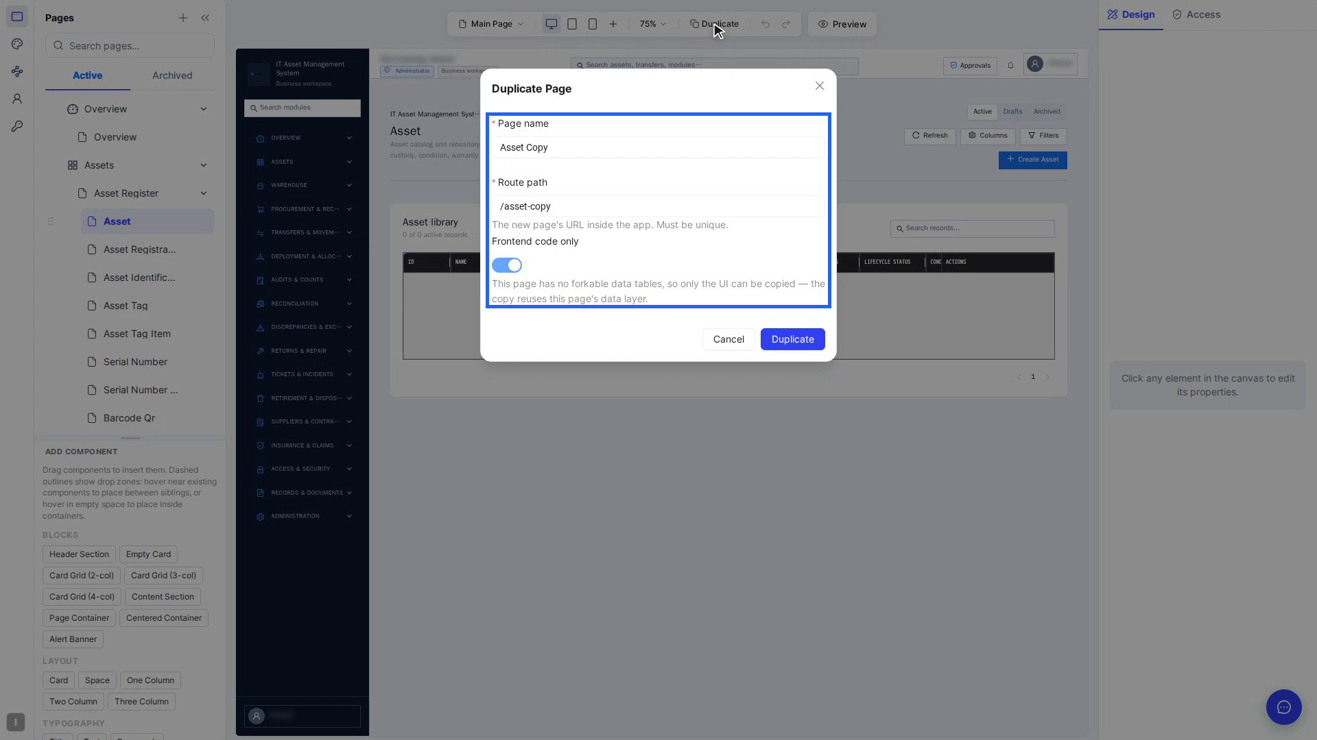
Duplicate a page
Open the page and select Duplicate above the canvas. Check the Page name and the Route path (it must be unique). Then choose:
- Frontend code only on: copies the layout only. The copy shows the same data as the original.
- Frontend code only off (the default): also copies the data tables, so the new page keeps its own records. You can rename the copied tables, relabel, remove or add fields.
Select Duplicate. When you see Page duplicated, the new page is in the Pages list.
See your data model: the ER diagram
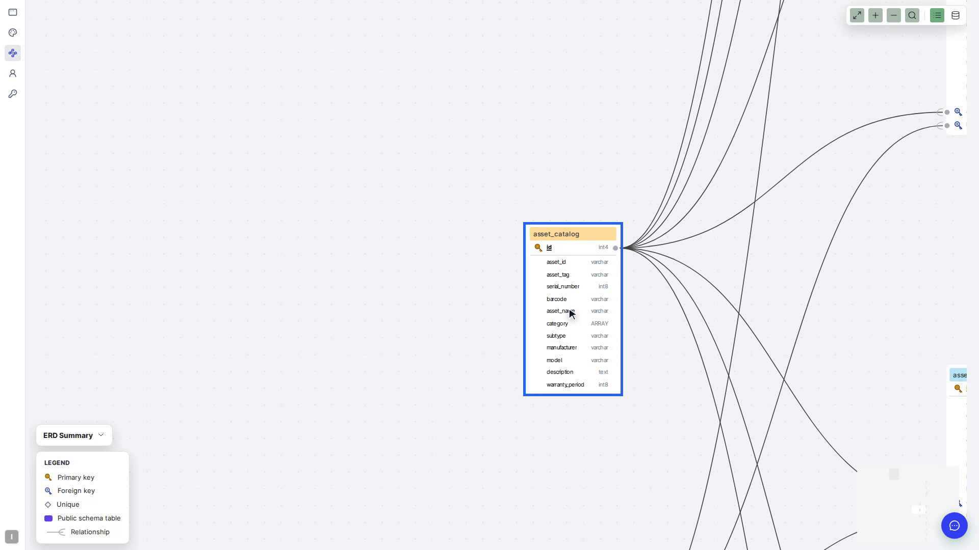
Select ER Diagram on the left bar. Each box is a table, and each row is a column with its data type, such as text, int8 or bool. Key icons mark the Primary key and Foreign keys, and bold columns are required. Lines show relationships, with the forked end on the "many" side. For example, one customer has many orders.
Use the toolbar to search for a table, zoom, Fit View, or switch between Compact view and Detailed view — all columns. ERD Summary shows the totals. The diagram is for looking only: dragging tables doesn't change your data.
Control who sees what
Three screens work together:
| Screen | What you do there |
|---|---|
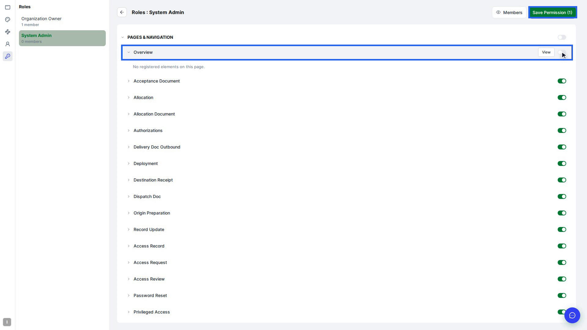
| Roles and Permissions (key icon) | Create roles (Add Role), then open a role and turn pages and named elements on or off for it under Pages & Navigation |
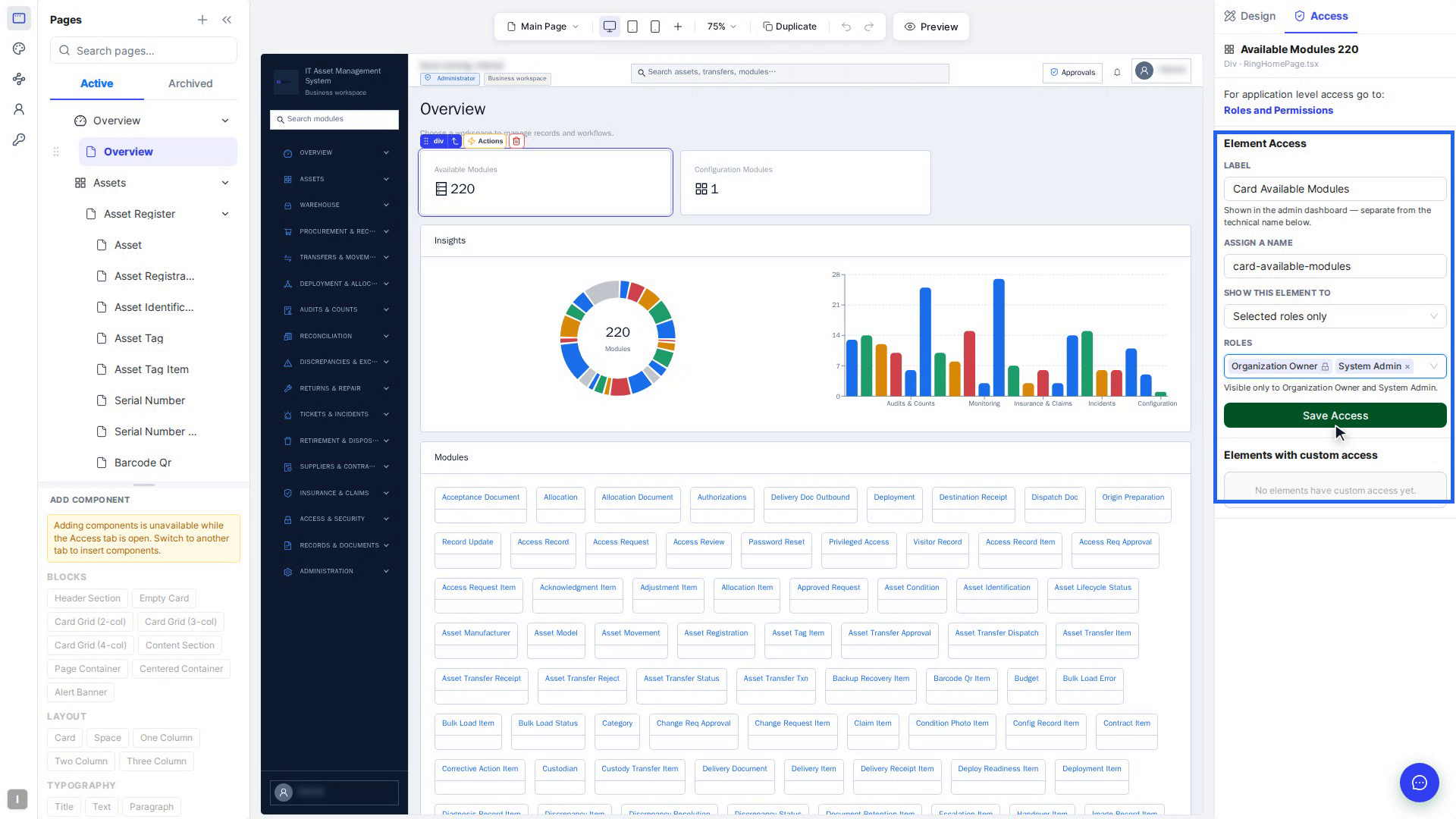
| Access tab (right panel) | Page Access: Show this page to everyone, Selected roles only or Everyone except selected roles. Element Access: give a button or section a name (for example btn-add-asset) and choose the roles that see it. Select Save Access. |
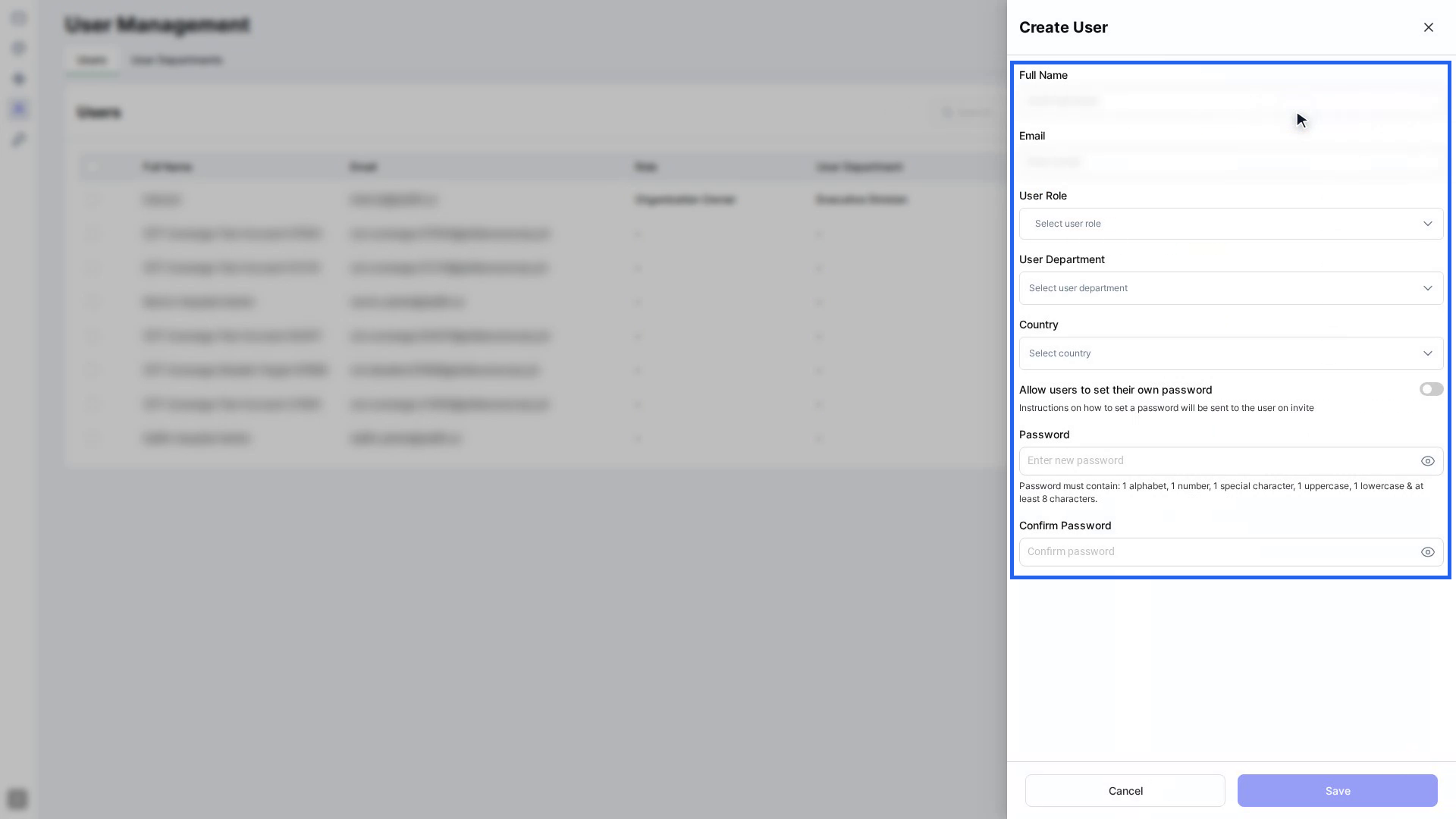
| User Management (person icon) | Add people (Add User), give them roles and a department, change passwords, archive and restore users, and Export to CSV. Departments are on the User Departments tab. |
To check the result, select Preview and choose a role in Preview as role. The canvas hides whatever that role can't see.
Preview, undo and save
- Saving: most edits save straight away. When a change needs a rebuild, such as a new component or field, wait for the page to update before the next big change.
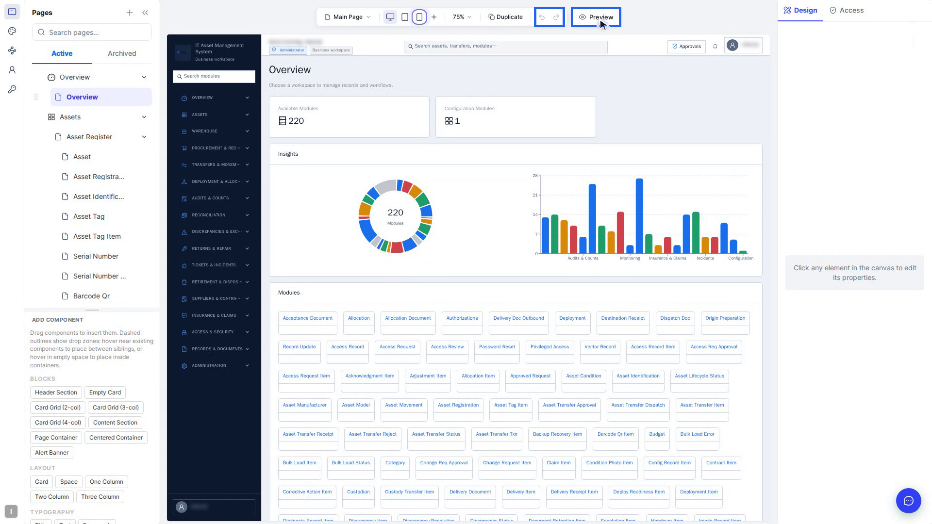
- Undo / Redo: the buttons above the canvas, or Ctrl+Z / Ctrl+Shift+Z (⌘Z / ⌘⇧Z on a Mac). Click on the canvas first if your cursor is in a text box.
- Preview: select Preview to click through the page as your users will, at any screen size and as any role. Select Exit Preview to go back to editing.
- Reload canvas: use it if the canvas looks out of date.
Screenshots
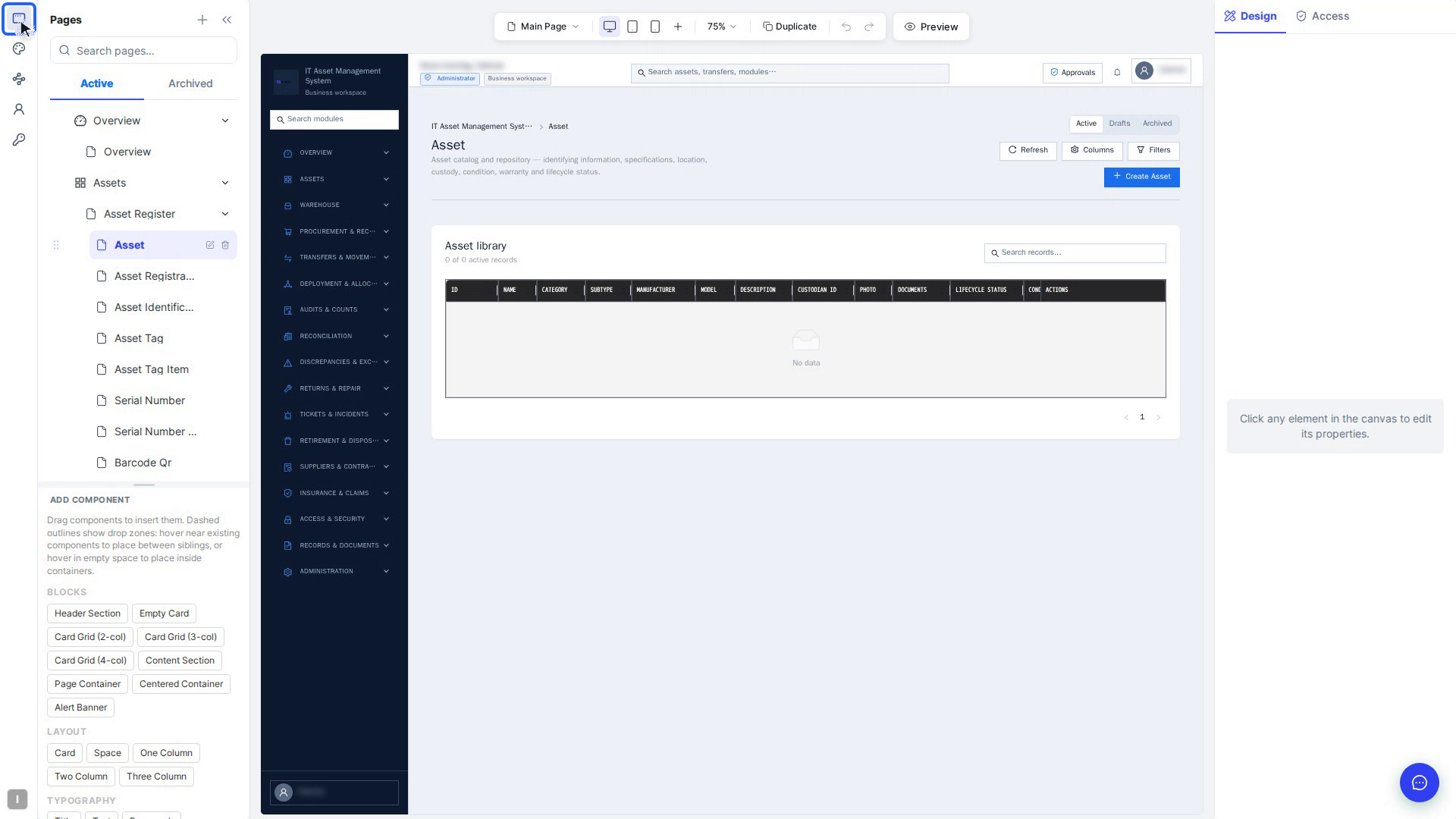
Step 1: Open the Customize editor
Select the Customize icon at the top of the left bar. Your app sits in the middle. Pages and Add Component are on the left, the canvas bar is above, and the Design panel is on the right.
Step 2: Select an element
Click an element on the canvas. The selection chip (highlighted) appears above it.
Step 3: Change a property on the Basic tab
With the Refresh button selected, turn on a switch under Button props (here, Danger).
Step 4: Change its look on the Advance tab
Open Advance and expand a style section, such as Background.
Step 5: Pick a screen size
Select Tablet in the bar above the canvas. The canvas switches to tablet width.
Step 6: Check which screen size you're editing
The blue note at the top of the panel shows Tablet · ≤991px.
Step 7: Drag a component onto the page
Drag Card from Add Component onto the canvas and drop it where the + Card label shows.
Step 8: Add an action in the Flow Builder
Select Actions in the chip. The flow starts with a Trigger; add nodes from the Nodes list.
Step 9: Theme your app
Select the palette icon on the left bar. The Theme Editor opens on the Theme tab.
Step 10: Set up a form field
Select a field in a form. Its settings are under Form field in the right panel.
Step 11: Duplicate a page
Select Duplicate above the canvas, check Page name, Route path and Frontend code only, then select Duplicate.
Step 12: Read the ER diagram
Select ER Diagram on the left bar. Each box is a table; the lines are its relationships.
Step 13: Set who can see an element
On the Access tab, name the element, choose the roles under Element Access, then select Save Access.
Step 14: Turn pages on or off for a role
Open Roles and Permissions, pick a role, switch a page off, then select Save Permission.
Step 15: Add a user
Open User Management, select Add User and fill in the Create User panel.
Step 16: Undo, redo and preview
Use Undo / Redo above the canvas, and select Preview to try the page as your users will.